City health services impact on public health in US
by Deepti Vijay Khandagale
Health is the most impotant aspect of life. Recognizing health as a paramount aspect of life, this study emphasizes the significance of fostering a healthy lifestyle and maintaining robust public health measures to enhance the overall quality of life.
Background
PLACES, the expansion of The 500 Cities Project, is a partnership project between the Center for Disease Control (CDC) and the Robert Wood Johnson. It focusses on new approaches towards model-based analysis of health estimates for local areas across the United States. For the first time, it supplied data for cities and census tracts, many of which covered multiple counties or did not follow county lines. These data can be filtered (by city and/or tracts, as well as by measure) and downloaded by end-users for use in different analyses.
The initiative provided the display, retrieval and exploration of health care data for the largest 500 cities at the selected city and tract level on the habits, and risk factors that have a significant impact on the health of the population.
Objective
The aim is to identify metrics and measures in the cities that predict the public health outcomes and can help to take preventive measures against the disease.
The analysis enables local health departments and authorities to better understand the burden and geographic distribution of health measures in their areas, independent of population size or rurality, and to aid them in planning public health actions. This project employed small area estimating methods to acquire 27 chronic illness indices for the 500 largest American cities by reporting city and census tract-level data. Visitors were allowed to refer, browse and download the data at city and tract levels, which was made public through the “500 Cities” website.
Despite the fact that data at the county and metropolitan levels was limited, this study was a first-of-its-kind data analysis that released information on a broad scale for cities and local areas within cities. This approach supplemented current surveillance data, allowing researchers to gain a better understanding of the health challenges that people of that city or census tract face.
How the data was collected?
The Center for Disease Control (CDC) has collected the data primarily from the CDC Behavioral Risk Factor Surveillance System, the Census 2010 population and the American Community survey. The only data used will be the CDC’s 2018 500 Cities Data. The Center for Disease Control is open about its data and techniques, as well as the limitations and issues, and their data is in the public domain (such as self-reported data). As a result, they’re perhaps the most reliable source of information on the subject.
The Centers for Disease Control and Prevention (CDC) is the public health agency of the United States of America. It works around the clock to protect America from both foreign and domestic health, safety, and security threats. CDC helps communities and citizens confront disease, whether it originates at home or abroad, is chronic or acute, curable or avoidable, caused by human error or a premeditated attack. As the nation’s health protection agency, the CDC saves lives and protects individuals from health threats. It conducts critical research and disseminates health information to protect the United States from hazardous health problems, as well as responding to them when they arise.
The PLACES Project took over from the 500 Cities Project in December 2020. It was a collaboration between the Centers for Disease Control and Prevention, the Robert Wood Johnson Foundation, and the CDC Foundation. It offered small area estimates for chronic disease risk factors, health outcomes, and clinical preventive care utilization for the major 500 cities in the United States at the city and census tract level. These small-area estimates aided cities and local health departments in better understanding the burden and spatial distribution of health-related factors in their jurisdictions, allowing them to better plan public health interventions. Individual cities and groupings of cities, as well as other stakeholders, might have used this high-quality, small-area epidemiologic data to assist create and implement effective and focused prevention programs, identify developing health problems, and establish and monitor critical health targets. City planners and elected officials, for example, may have wished to utilize this information to target neighborhoods with high rates of smoking or other health-risk behaviors for successful interventions.
The good thing about the dataset is that it is organized in a dataframe hence making it easier for analysis. However, the dataset is not clean i.e there are unnecessary and null values in the data set that needs to be cleaned. Hence, we will do a data cleaning for accurate analysis and predictions. The dataset is available in the public domain making it easier for researchers and analysts to use it and make recommendations to the relevant stakeholders.
Here I am trying to find the answer to some of my assumptions:
-Does the city make a difference in how much a population uses preventative services? -Does cities has any influence on changing the health behaviors of public? -What factors can city heath providers focus on to drive greater use of the services?
To answer the above questions, it will be a good start to look at the data first and then try to interpret the data using different statistical measures.
Methodology for descriptive analysis
For the analysis, I am going to use RStudio. The necessary R packages and libraries include:
library(ggplot2) #for visualization
library(tidyverse) #for cleaning the dataset
library(dplyr)  #for data manipulation
In order to perform the data pre-processing and analysis first step is to understand about your data.
#Loading the dataset
data_health<-read.csv("500_Cities__Local_Data_for_Better_Health__2019_release.csv",header=T)
head(data_health)
str(data_health)
dim(data_health)
The snapshot of output of the code str(data_health) is given in figure below. The entire output of the code can be found here [R markdown and link]
![str data_health].1.png)
In the output, you can see that there are 810,103 observations and 24 variables (i.e 810,103 rows and 24 columns in a dataframe). The structure of each variables are given. For example, for “StateAbbr”, the datatype is “chr” (character) and displays a short list of observations under the variable.
After studying your data carefully and noted that datatype, dimension, structure of the data, it is neccessary to know if your data is clean. As the data may contain missing values or unnecesarry features, I will follow the data pre-processing which includes data cleaning and feature selection:
- Removal of variables that are not necessary for analysis
- Removal of duplicates.
- Removal of extreme values
- Selection of important features
colnames(data_health)
skim_without_charts(data_health)

 Output code link
The output tells us the n_missing values in the given data against each variables. I need to either fill this missing values or remove it, so that our model can fit into the data.
#Data Cleaning & Transformation
#Removing unncessary variables
data <- select(data_health, -"StateDesc",-"DataSource", -"Data_Value_Unit", -"DataValueTypeID", -"UniqueID",
                      -"Measure", -"GeoLocation", -"Short_Question_Text", -"Low_Confidence_Limit",-"High_Confidence_Limit", -"Data_Value_Footnote_Symbol", -"Data_Value_Footnote", -"Category", -"CategoryID", -"CityFIPS", -"Year")
head(data)

#Renaming to loIrcase with underscores for style guide purposes.
data <- rename(data, geographic_level = GeographicLevel, state_abbr = StateAbbr, data_value_type = Data_Value_Type, tract_fips = TractFIPS, city_name = CityName,  measure_id = MeasureId, data_value = Data_Value, population_count = PopulationCount)

colnames(data)
str(data)
glimpse(data)
Output link Now I have succesful removed the unncessary 16 colmuns which are mentioned in the code and in addition to that, I have renamed the column names for style guide purposes and now I will re-check the data sructure. The data is now reduced to the 810,103 observations and 8 variables and the column names have been changed.
The snapshot of the summary of data is given below:
.png)
Before moving ahead, it is necessary to know that the model cannot fit into the character datatype (i.e data which has categories) and hence I will convert those datatypes into numerical values. After that I will check the statistical description.
#converting to numeric
data$population_count<-as.numeric(data$population_count)

#list the column names
colnames(data)
skim_without_charts(data)

#summary statistics
summary(data)
Output link

After carefully studying the data I will now begin building the dataframe which will give us a summary of type. To answer our research questions ,the variables which are likely to be used for study are preventive measures and healthy behaviors where the city can have direct influence, which may then impact the health outcomes. For this, I will carry out hypothesis testing and begin by looking at preventative services which consist of a number of outcomes. I will also use this dataset to predict if the measures taken by cities have a significant influence on the healthy behaviors within the population. Some of the variables that will help answer this question include: “No leisure-time physical activity among adults aged >=18 Years” (LPA) ”Sleeping less than 7 hours among adults aged >=18 Years” (SLEEP) “Binge drinking among adults aged >=18 Years” (BINGE) ”Current smoking among adults aged >=18 Years” (CSMOKING)
library(tidyr)
cities <- data %>%
  filter(geographic_level == "City", state_abbr != "US", data_value_type == "Crude prevalence") %>%
  select(-tract_fips) %>%
  arrange(city_name) %>%
  pivot_wider(names_from = measure_id, values_from = data_value) %>%
  tidyr::unnest(cols = c(STROKE, HIGHCHOL, BPHIGH, BPMED, CHOLSCREEN, OBESITY, PHLTH,
                         DENTAL, CSMOKING, DIABETES, LPA, CANCER, PAPTEST, KIDNEY,
                         ARTHRITIS, ACCESS2, COREW, COPD, COREM, SLEEP, CHECKUP, BINGE,
                         CHD, MHLTH, COLON_SCREEN, TEETHLOST, CASTHMA, MAMMOUSE))

head(cities)

census <- data %>%
  filter(geographic_level != "City", state_abbr != "US") %>%
  arrange(city_name) %>%
  pivot_wider(names_from = measure_id, values_from = data_value) %>%
  tidyr::unnest(cols = c(STROKE, HIGHCHOL, BPHIGH, BPMED, CHOLSCREEN, OBESITY, PHLTH,
                         DENTAL, CSMOKING, DIABETES, LPA, CANCER, PAPTEST, KIDNEY,
                         ARTHRITIS, ACCESS2, COREW, COPD, COREM, SLEEP, CHECKUP, BINGE,
                         CHD, MHLTH, COLON_SCREEN, TEETHLOST, CASTHMA, MAMMOUSE))

head(census)
skim_without_charts(census)
Output link

Looking at the above output, you will find that I have tried to look at disease types and the value at city level. I will now be able to look at the dimension, datatype and find out missing values in the census dataframe.

If you see, the missing value in “PAPTEST” is hig and hence I will eliminate this column from our data. I will also rename the columns for better styling guide
#Removing Paptest
colnames(cities)
census <- census %>%
  select(-"PAPTEST")
cities <- cities %>%
  select(-PAPTEST)

# Renaming the revised tables for style guide purposes:
cities <- rename(cities, stroke = STROKE, highchol = HIGHCHOL, bphigh = BPHIGH, bpmed = BPMED,
                       cholscreen = CHOLSCREEN, obesity = OBESITY, phlth = PHLTH, dental = DENTAL,
                       csmoking = CSMOKING, diabetes = DIABETES, lpa = LPA, cancer = CANCER,
                       kidney = KIDNEY, arthritis = ARTHRITIS, access2 = ACCESS2, corew = COREW,
                       corem = COREM, copd = COPD, sleep = SLEEP, checkup = CHECKUP, binge = BINGE,
                       chd = CHD, mhlth = MHLTH, colon_screen = COLON_SCREEN, teethlost = TEETHLOST,
                       casthma = CASTHMA, mammouse = MAMMOUSE)

census <- rename(census, stroke = STROKE, highchol = HIGHCHOL, bphigh = BPHIGH,
                             bpmed = BPMED, cholscreen = CHOLSCREEN, obesity = OBESITY, phlth = PHLTH,
                             dental = DENTAL, csmoking = CSMOKING, diabetes = DIABETES, lpa = LPA,
                             cancer = CANCER, kidney = KIDNEY, arthritis = ARTHRITIS, access2 = ACCESS2,
                             corew = COREW, corem = COREM, copd = COPD, sleep = SLEEP, checkup = CHECKUP,
                             binge = BINGE, chd = CHD, mhlth = MHLTH, colon_screen = COLON_SCREEN,
                             teethlost = TEETHLOST, casthma = CASTHMA, mammouse = MAMMOUSE)
It is important to look if the data is bias. I will do that by visualizing the city level data
str(census)
census$population_count= as.numeric(census$population_count)
census<<-na.omit(census)
states <- census %>%
  group_by(state_abbr) %>%
  filter(geographic_level != 'City', state_abbr != "US") %>%
  summarize("population" = sum(population_count), "cities" = length(unique(city_name))) %>%
  arrange(-cities)

states$population= as.numeric(states$population)
print(states)

ggplot(states, aes(x=reorder(state_abbr,population), y=population )) + geom_bar(stat = "identity") + theme(axis.text.x = element_text(angle = 90)) + scale_x_discrete("US States")

I have created the visualization of the populattion against the states. As you can see, this data is skeId considerably in favor of a few states. For a variety of reasons, including culture, legislation, and weather, I can’t assume that what works in California would work in Alaska. However, 11 states had only one city investigated, while California has 83. The accuracy of my findings could therefore be affected by the client’s location. This happened because the study concentrated on the country’s largest cities, then added a few more to guarantee that every state was covered. With this in mind, it’s understood if you’re concerned about how this would apply to a tiny town.
Results and findings
Now lets go back to our research questions.
RESEARCH QUESTION 1
Does the city make a difference in how much a population uses preventative services?
The usage of preventative services and healthy behaviors are likely, the variables within the study that a city can directly influence, which may therefore impact health outcomes. To verify that theory, I’ll start with preventative services, which include things like:
- “Current lack of health insurance among adults aged 18–64 Years,” (ACCESS2)
- “Visits to doctor for routine checkup within the past Year among adults aged >=18 Years,” (CHECKUP)
- Fecal occult blood test, sigmoidoscopy, or colonoscopy among adults aged 50–75 Years,” (COLON_SCREEN)
- “Mammography use among women aged 50–74 Years,” (MAMMOUSE)
- “Visits to dentist or dental clinic among adults aged >=18 Years,” (DENTAL)
- “Cholesterol screening among adults aged >=18 Years,” (CHOLSCREEN)
- “Older adult men aged >=65 Years who are up to date on a core set of clinical preventive services: Flu shot past Year, PPV shot ever, Colorectal cancer screening,” (COREM)
- “Older adult women aged >=65 Years who are up to date on a core set of clinical preventive services: Flu shot past Year, PPV shot ever, Colorectal cancer screening,” (COREW) “Papanicolaou smear use among adult women aged 21–65 Years.” (PAPTEST)
Is it true that the size of a city has an impact on how much a population uses preventative services. If there is a difference, it indicates that it is something that the city can influence and change. If not, it’s possible that the United States as a whole has its own patterns of preventative service use, and the city will have to search elsewhere for effective ways to enhance its health.
summary(select(cities, "access2", "checkup", "colon_screen", "cholscreen", "corem", "corew", "mammouse", "dental"))

difference <- summarize(cities, "access2" = max(access2)-min(access2), "checkup" = max(checkup)-min(checkup),
                        "colon_screen" = max(colon_screen)-min(colon_screen), "cholscreen" = max(cholscreen)-min(cholscreen),
                        "corem" = max(corem)-min(corem), "corew" = max(corew)-min(corew), "mammouse" = max(mammouse)-min(mammouse),
                        "dental" = max(dental)-min(dental))

difference <- pivot_longer(difference, everything(), names_to = "measure", values_to = "value")

ggplot(data = difference) +
  geom_col(mapping = aes(x = reorder(measure, -value), y = value), fill = 'blue') +
  labs(title = "Difference Between Cities", x = "Preventative Service", y = "Size of Difference")

maxmin_preventative <- cities %>%
  filter(access2 == max(access2)|access2 == min(access2))

View(maxmin_preventative)
As you can see, there are variances between all of the preventative services, some of which are rather significant. The gap between cities in terms of access2, a measure of how much of a population lacks health insurance, can be as large as 4.50 percent of the population vs. 44.40 percent. Access2 has piqued my interest because it is the one that has the most difference between cities (albeit very narrowly), as well as for other reasons that will be detailed shortly. I’d like to learn more about its distribution:
library(ggpubr)
plot_cities <-ggplot(data = cities) +
  geom_histogram(mapping = aes(x = access2), na.rm = TRUE, binwidth = 2) +
  labs(title = "Distribution of Lack of Health Insurance", x = "Population Lacking Health Insurance", y = "Cities Lacking Health Insurance")

box_cities <- ggplot(data = cities) +
  geom_boxplot(mapping = aes(y = access2), na.rm = TRUE) +
  labs(title = "Distribution of Lack of Health Insurance", y = "Population Lacking Health Insurance")

ggarrange(plot_cities, box_cities,  ncol = 2, nrow = 1)

As you can see, there appear to be some outliers on the high end. Most of the data lies between 10 and 20 percent, meaning that it is likely the client will have at least some options for improvement in this area
RESEARCH QUESTION 2
Can Cities Impact Healthy Behaviors?
As previously stated, I will primarily consider obesity as a result rather than a behavior. As a result, I’ve identified four healthy behaviors that a city can influence: *“There is no leisure-time physical activity among persons over the age of 18” (LPA)
- “Sleeping fewer than 7 hours in adults over the age of 18” (SLEEP)
- “Binge drinking in adults over the age of 18” (BINGE)
- “Adults above the age of 18 who are currently smoking” (CSMOKING)
summary(select(cities, "csmoking", "sleep", "lpa", "binge"))

unhealthy_behavior <- summarize(cities, "csmoking" = max(csmoking)-min(csmoking), "sleep" = max(sleep)-min(sleep),
                        "lpa" = max(lpa)-min(lpa), "binge" = max(binge)-min(binge))

unhealthy_behavior <- pivot_longer(unhealthy_behavior, everything(), names_to = "measure", values_to = "value")

ggplot(data = unhealthy_behavior) +
  geom_col(mapping = aes(x = reorder(measure, -value), y = value), fill = "red") +
  labs(title = "Difference Between Cities", x = "Unhealthy Behavior", y = "Size of Difference")

The disparity isn’t as pronounced as it is in some of the poorest preventative services. The biggest disparity is in the lack of leisure-time physical exercise, which is 44.2 percent vs 12.60 percent. It’s comparable, except the maximum and minimum values are significantly higher. It’s odd, though, that different cities have such disparities in the percentages of people who engage in leisure-time physical activity.
I will take a closer look at the variable that makes the most difference once more.
plot_phy <- ggplot(data = cities) +
  geom_histogram(mapping = aes(x = lpa), na.rm = TRUE, binwidth = 2) +
  labs(title = "Cities Without Leisurely Physical Activity", x = "Population Without Leisure Physical Activity", y = "Count of Cities")

box_phy <- ggplot(data = cities) +
  geom_boxplot(mapping = aes(y = lpa), na.rm = TRUE) +
  labs(title = "Cities Without Leisurely Physical Activity", y = "Population Without Leisure Physical Activity")

ggarrange(plot_phy, box_phy,  ncol = 2, nrow = 1)

Now that I’ve established that cities use preventative services differently, I need to figure out why. What can the city do to encourage more people to use the services?
The initial hypothesis is based on the inclusion of access2, which is the percentage of the population that are uninsured. As the name implies, I believe this can tell us whether a population is not getting preventative care because they do not have insurance, making the services unaffordable. If this is the case, the small city could make a difference in the usage of preventative treatments by assisting their citizens in becoming insured or ensuring that the services are available in an accessible and affordable manner. I will now create a correlation matrix followed by a heatmap. I will be looking at the use of preventative services and will be interested in any correlations with an absolute value above 0.65.
correlated_use <- census%>%
  drop_na() %>%
  select(access2, dental, checkup, corem, corew, cholscreen, colon_screen, mammouse) %>%
  cor()

print(correlated_use)

heatmap(correlated_use, main = "Correlations of Preventative Care", Colv = NA, Rowv = NA, margins = c(9, 9), scale = "none")
From the heatmap, the relationships between access2 and dental, corem, corew, cholscreen, and colon screen are among the more intriguing. Also visible are connections between corem and corew, as well as correlations with dental, cholscreen, and colon screen. Surprisingly, dental has a link to cholscreen and colon screen.
It is surprising that there was no stronger link between access2 and checkup, or checkup and some of the other metrics. However, access2 has the strongest connection with the most variables. This doesn’t strictly confirm my notion (we would need additional data), but it does give it some credence as a possibility.
RESEARCH QUESTION 3
Does the use of health services make any Difference in the city?
The second consideration is whether or not using these services is beneficial. The client’s purpose isn’t to force residents to use its preventative services. Its goal is to improve the residents’ health. Use of preventative services may be one of the areas where cities may make the most difference, but does their use have an impact on the city’s health? the following outcomes Ire used “Stroke in people over the age of 18” (STROKE) “Obesity in people beyond the age of 18” (OBESITY) “All teeth are lost in adults over the age of 65.” (TEETHLOST) “Diabetes diagnosed in adults over the age of 18” (DIABETES) “Cancer in adults over the age of 18 years (excluding skin cancer)” (CANCER) “Chronic obstructive pulmonary disease (COPD) in people over the age of 18” (COPD) “Coronary heart disease in adults above the age of 18” (CHD) “Current asthma in people over the age of 18” (CASTHMA) “Chronic renal disease in persons above the age of 18” (KIDNEY) “Taking medication to treat high blood pressure in persons over the age of 18 who have high blood pressure” (BPMED) “High cholesterol in persons over the age of 18 who have had a screening in the previous 5 years” (HIGHCHOL)
summary(select(cities, "phlth", "mhlth", "bphigh", "arthritis", "stroke", "obesity", "teethlost", "diabetes", "cancer", "copd", "chd",
               "casthma", "kidney", "bpmed", "highchol"))

ggplot(data = census) +
  geom_smooth(mapping = aes(x = access2, y = phlth), method = 'gam', color = 'purple', na.rm = TRUE) +
  geom_smooth(mapping = aes(x = access2, y = mhlth), method = 'gam', color = 'blue', na.rm = TRUE) +
  labs(title = "Physical and Mental Health with Insurance", x = "Percent of Population Without Health Insurance",
       y = "Percent of Population With Poor Physical Health Over 14 Days") +
  annotate("text",x = 39, y = 21, label = "Poor Physical Health Over 14 Days", color = 'purple') +
  annotate("text",x = 44, y = 15, label = "Poor Mental Health Over 14 Days", color = 'blue')

As you can see, the number of people who have battled with physical health and mental health increases in cities as the number of people without health insurance rises. This is a fascinating result, especially since I’ve already seen that health insurance corresponds with the usage of other measurable preventative treatments. There may also be preventative services and treatments that were not measured but are nonetheless influenced by health insurance.
I can look at the function of health insurance in high cholesterol and cholesterol testing as another, particularly intriguing example:
par(mfrow=c(2,2))
scatter_insure <- ggplot(data = census) +
  geom_point(mapping = aes(x = cholscreen, y = highchol, color = access2), na.rm = TRUE) +
  labs(title = "The Impact of High Cholesterol on Cholesterol Screenings", x = "Cholesterol Screenings",
       y = "Percent Population with High Cholesterol")

line_insure <- ggplot(data = census) +
  geom_smooth(mapping = aes(x = access2, y = cholscreen), color = 'purple', na.rm = TRUE) +
  geom_smooth(mapping = aes(x = access2, y = highchol), color = 'blue', na.rm = TRUE)+
  labs(title = "The Impact of Insurance on High Cholesterol and Screenings",
       x = "Percent of Population Without Health Insurance", y = "Percent with High Cholesterol or Screened") +
  annotate("text",x = 17, y = 80, label = "Cholesterol Screenings", color = 'purple') +
  annotate("text",x = 50, y = 37, label = "High Cholesterol", color = 'blue')

ggarrange(scatter_insure, line_insure, nrow = 1, ncol = 2)

As you can see, the greater the number of people who have high cholesterol, the more people who are screened for it. When health insurance is included in, however, I can see that people without health insurance are more likely to have high cholesterol and are less likely to be evaluated for it.
Let’s have a look at the overall correlations:
correlated_prevention <- census%>%
drop_na() %>%
select(access2, checkup, corem, corew, cholscreen, colon_screen, mammouse,
dental, phlth, mhlth, stroke, highchol, bphigh, bpmed, obesity, copd,
diabetes, cancer, kidney, arthritis, chd, teethlost, casthma) %>%
cor()
print(correlated_prevention)
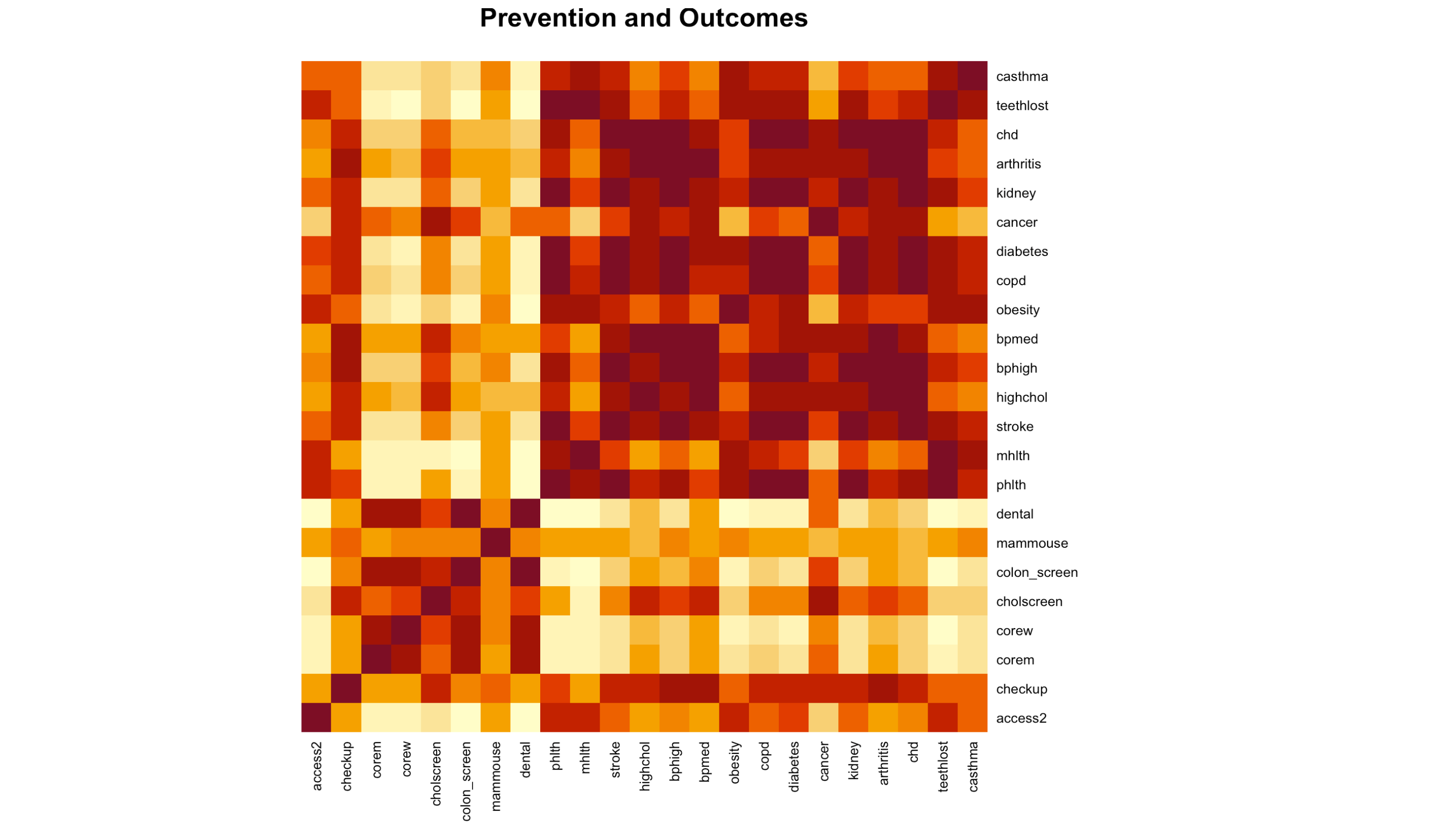
heatmap(correlated_prevention, main = "Prevention and Outcomes", Colv = NA, Rowv = NA, margins = c(10, 10), scale = "none")

Observations:
Access2 has a link to phlth, mhlth, and teethlost, which was previously discovered to have a link to the utilization of preventative treatments. There is a link between checkup and bphigh and bpmed. Corem and corew have links to phlth, mhlth, and tooth loss. Only Corew is compatible with diabetes and kidney disease. Cholscreen has an odd relationship with cancer and health. phlth, mhlth, and teethlost are used in colon screen. Dental problems include phlth, mhlth, stroke, obesity, copd, diabetes, kidney failure, and tooth loss. There’s always the chance of coincidental correlations, and everything is exacerbated by the fact that many of these outcomes are highly correlated. High levels of diabetes, coronary heart disease, and COPD, for example, are all linked to an increased risk of stroke:
##Key Findings
- Because a population’s health insurance, usage of preventative services, and even harmful behaviors can differ throughout places, there is a chance (but not a guarantee) that they will be influenced by them.
- It does not appear that the size of the city makes a difference.
- Negative health outcomes are linked to a high prevalence of unhealthy habits and/or insufficient utilization of preventative interventions.
- As a result, the research does not rule out the possibility that a city can reduce the number of strokes, coronary heart disease, high cholesterol, diabetes, and other adverse health consequences.
- The two variables that differ the most between cities are also the ones that correlate the most with a range of other variables.
- Failure to employ many preventative services is linked to a lack of health insurance.
- This lends some credence to the theory that a part of the population is deterred from using these services due to their high cost.
- Physical inactivity during leisure time is linked to a variety of unfavorable health effects.
Limitations
This analysis has a number of flaws, the most notable of which is the lack of data pertaining to the envisioned customer city. I recommend that any small city look into the health issues that are now plaguing its population for additional research and more precise, accurate recommendations. The CDC’s data can be used to create a model for future research. Interventions can thus be tailored to the specific health issues that a group faces. Missing values has an impact on the reliability of the results of the analysis.
References:
- PLACES
- Data Collected from:
- Data Information